It’s not easy choosing green.
For most of us, the color green brings to mind growth and rebirth, and freshness. It evokes visions of spring grass and deep forests. The greens that surround us as we walk outdoors bring us peace and comfort. As a mixture of blue and yellow, green is both warming and cooling. It’s no surprise, then, that green is considered one of the most restful and relaxing colors to the eye. But also the most complicated to use.
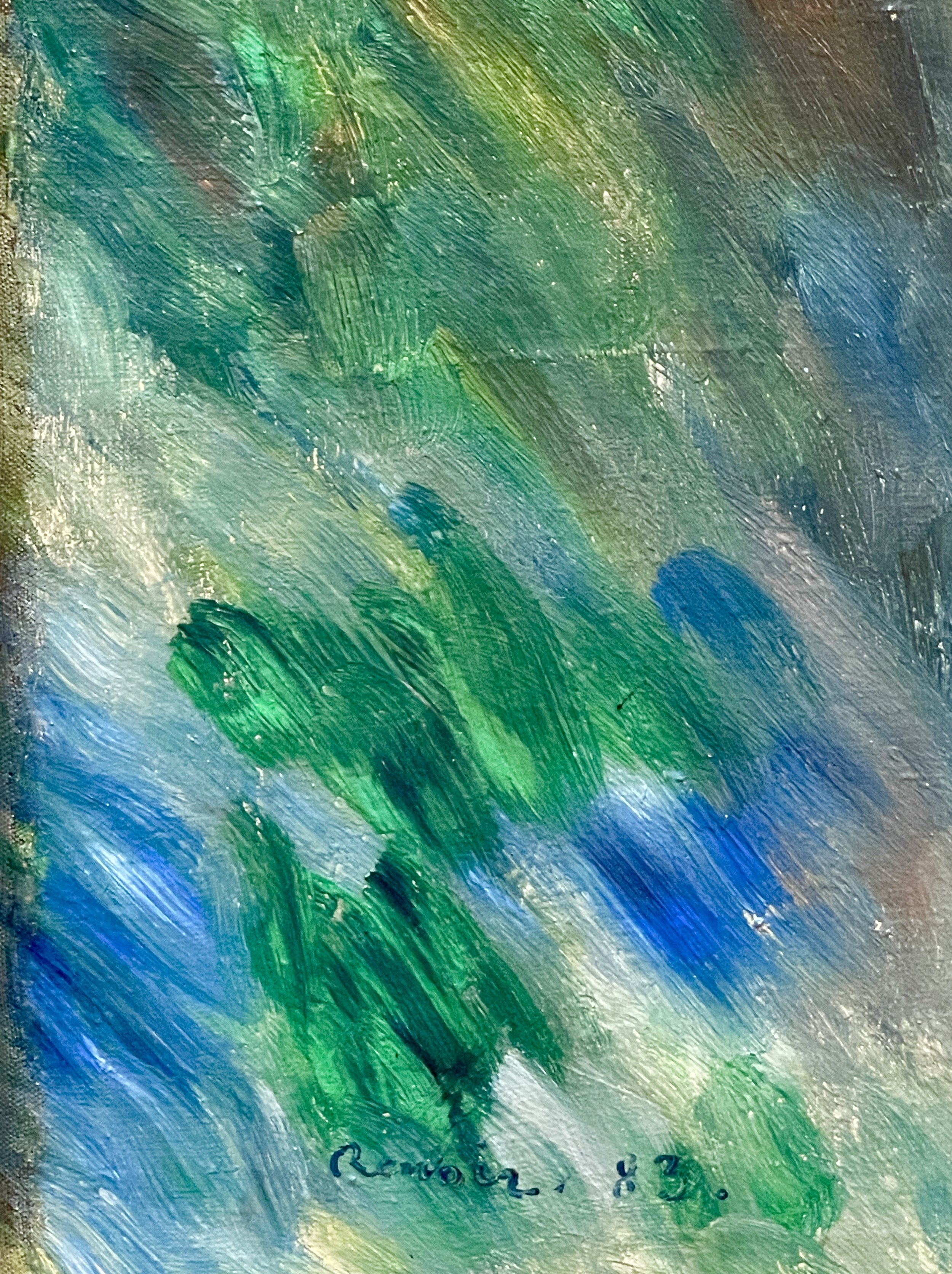
I have always been drawn to the impressionist movement, and maybe my attraction to green is why: they seemed to have mastered the use of nature’s most complex color in their work. Although the use of green in art can be traced back to the Egyptians, it was not until well into the impressionist period that green became ubiquitous. Before that time, most green paint contained toxic chemicals and was very expensive. Once green pigments became safe and affordable, green appeared everywhere. Artists became able to truly mimic nature - finding the perfect combinations and balance of greens.
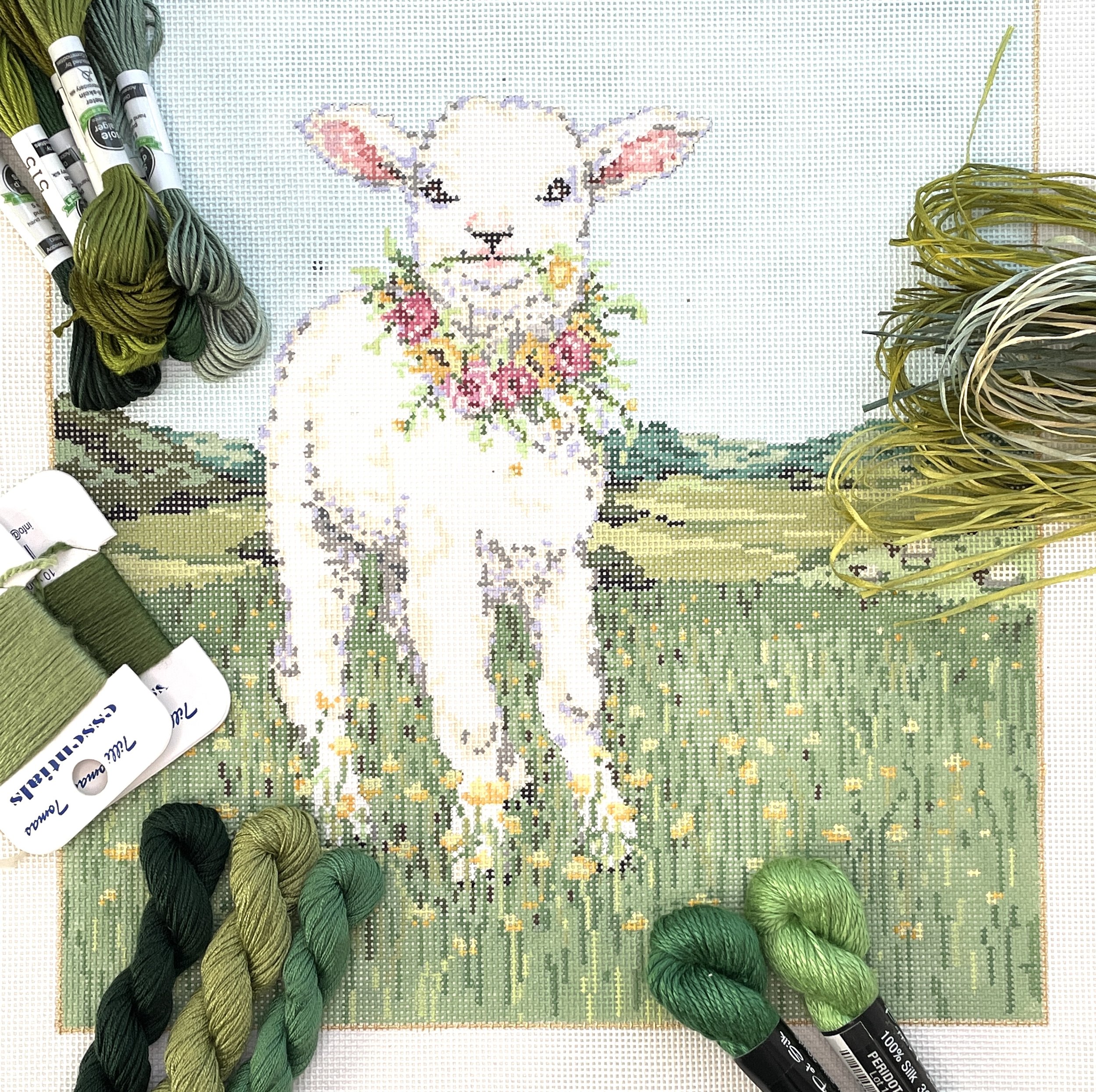
At least once a day in the shop, I am challenged with the question, “What green (or greens) should I use?”. Sometimes the color choice is straightforward. A “Christmas green” for a holiday canvas is typically fairly easy to find. But “grass green” might be more difficult, and a canvas with several variations of green even more difficult yet. Consider the the number of greens in this stunning canvas stitch painted by Carol Curtis:

Typically when I am pulling threads for a complex canvas I begin by looking at sections. I might begin with the crab, for example. But given the complexity of this canvas - and particularly the complexity of its greens - I might narrow my approach even further, starting with the bottom right and examining the greens and considering their shades and their values (darkness or lightness). Sometimes I place a possible thread on the canvas and realize that I’ve identified the shade correctly but I need a thread that is lighter or darker. If I’m lucky, I’ll find just what I need right next to the shade I originally pulled. I repeat this process for each of the green shades on the canvas.
From time to time I need to push myself not to shy away from greens that are not my favorite. Nature and art have taught me that the spectrum of greens can often be mixed together to have a pleasing effect, and almost always, the artist’s choice is one that works. Before I consider my thread choices finished, however, I stand back and make sure that none of my choices are jarring - that all of my colors play nicely together .
We are always happy to help you choose the greens for your next canvas. I encourage you, however, to dip your toes into the pool of experimentation. Take some greens off the wall and see how they look on your canvas. Sometimes I begin to stitch and realize I’m not entirely happy with my choices, take it out, and try a different thread or shade. We can learn from our choices. Play around. You’ll gain confidence quickly.